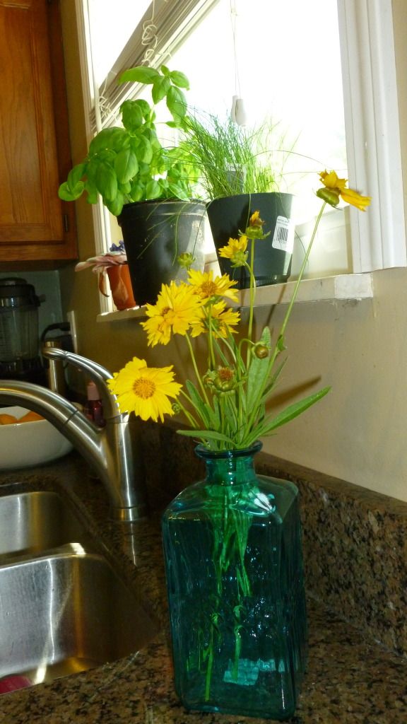
Like most people, we tend to spend a lot of time in our kitchen. However this is probably my least favorite space in our house. The kitchen is decent size kitchen compared to some, however the arrangement probably could have been laid out better. I now know what I want and don't want in a future house and a spacious kitchen ranks high on my list, probably #1. But we can't get everything we want so here's a peek into what we did with the space we have.
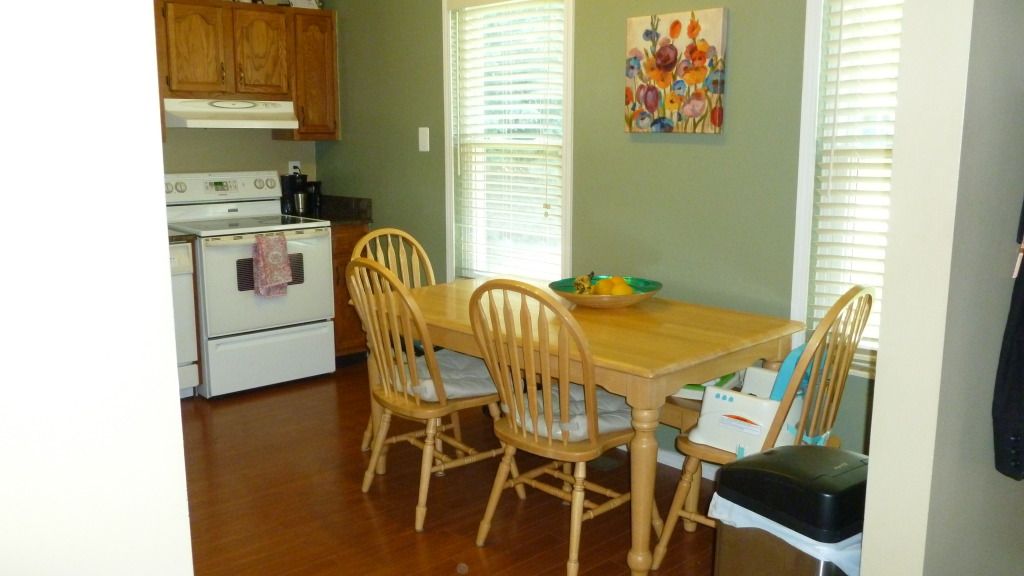
I'm hoping to make some changes, painting the cabinets white, paint the walls a more neutral color, bring in more functional accessories to brighten the room.
-stephanie

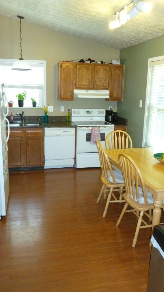
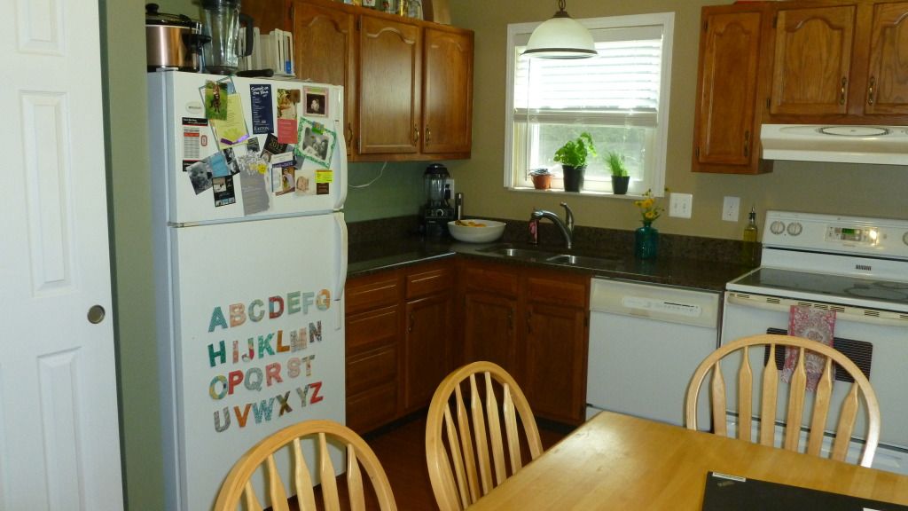
Cute space! I know what you mean about poor layouts. I often wonder what the person who designed our kitchen was thinking!
ReplyDeleteVery cute! I really like the ABC's on the fridge!
ReplyDeleteI love your ABCs on your fridge! They're so pretty.
ReplyDeleteI think it looks great:) And yes, the ABC's are super cute. Found you via "growing up geeky"...just signed on to follow!
ReplyDeletewww.vossfamilybainbrige.blogspot.com
The vaulted ceiling is nice! High ceilings always make spaces more roomy!
ReplyDelete